
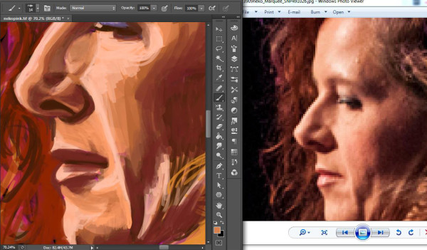
Digital Portraiture, or How I Painted Neko Case Pt. 3

Neko Case, Austin City Limits 2014, reference provided by Scott Newton.
Welcome back to my three-part tutorial on digital portraiture, using my most recent Neko Case piece. For those just joining, here’s some links to catch you up:
– Part 1
– Part 2
– Timelapse Video
Now onto Part 3, the fun part where we actually start painting!
Starting the Portrait
I have found it useful to draw on a separate layer from the background layer when I do digital art. This frees me up to change the background color and texture later at my convenience without having to paint around the subject. I’ll usually do a basic color ‘wash’ with the fan brush on the background layer and then start sketching on a new layer.

In the Wet Media presets I use a round brush for my initial sketching out of the picture. To save time later, I use line colors that match the colors of the reference instead of just standard black.
Once I have done an initial sketch I begin filling in areas of color with the fan brush– just basic blobs of shape to start.

Color mixing in digital work can be done optically (by placing colors next to each other and letting the eye ‘blend’ them) or by using the brush’s natural transparency (turning on Buildup in the brush settings will enhance this and make it more like airbrush, watercolor, or ink washes). This second technique is akin to alla prima, or ‘mixing on the canvas’.

As far as picking which color to use, you obviously can’t mix them on a palette and need to just pick them directly. I pick my colors via the aptly named Color Picker tool in Hue/Saturation/Brightness (HSB) mode, and as I work I’ll use the Eyedropper tool to sample colors already in my painting and tweak them with HSB as needed.

Continuing the Portrait
If you are already a portrait artist you already have general techniques that most likely will apply here. Artists work very differently when they draw. For example, some people like to finish a section before moving on. I like to work more generally, developing everything together, to make sure the proportion stays accurate. This is because I draw freehand; many artists use a grid technique to maintain proportion.
Because everyone has their own techniques for portrait drawing, I will just list out some tips that I’ve picked up or discovered, especially while figuring out how to do this digitally:

1. Use more saturated colors to start as sort of an undercolor. It’s better to start bright and saturated; you can always tone colors down with shading later.
2. Round brush is best for small details and lines, while fan is best for shading and large color areas.
3. Whites are rarely just ‘white’. For example, eye whites do better with a touch of blue in them; teeth a touch of yellow.
4. It’s best to draw dark areas first and then highlights on top. Especially for hair; everyone always asks me how I do hair (the answer is carefully and intricately). Hair gets its look by the way the light hits it, meaning what you’re usually seeing and therefore painting is a mass of darker color with lighter individual strands on top.

5. When in doubt, measure. With faces, one little thing can throw the likeness off, and oftentimes it’s not obvious what that little thing is. So measure often. That’s actually my number one piece of advice about portraiture.
6. Speaking of proportion: the only (one weird) Photoshop ‘trick’ I use is if I have developed something to my liking but the proportion is slightly off. I’ll Lasso tool the part that’s off and nudge it a bit with the Move tool until it looks right. That’s a quick technique for moving parts of a picture around.

7. Only use black in the darkest parts. Even in traditional mediums painters rarely use black, even to darken existing colors. Instead, they often mix some of the complementary color in to make the colors appear darker without desaturating them too much. Black by itself is as dark as you can get so you don’t want to overuse it. Although the way to darken a color digitally is to add black (by decreasing brightness), sometimes increasing the saturation while you decrease the brightness can help keep your color from getting too gray.
8. Textures like stubble and fabric may require different brushes, like a stipple-type brush. You can also use the tip of the fan brush for a stipple effect.


9. Highlights usually go on last thing. You can use pure white for the brightest parts. Like the black, don’t overuse white.
10. Chiaroscuro is super important in portraiture, especially for tricky parts like noses where you don’t have a lot of contour to guide you. Getting the right mix of highlight and shadow will sculpt these areas.
That’s about all I can think of to talk about in regards to digital portraiture. If you have any questions about it, or traditional portraiture, leave a comment below!
Digital Portraiture, or How I Painted Neko Case Pt. 2
Neko Case, Austin City Limits 2014, reference provided by Scott Newton.
Welcome back to my three-part tutorial on digital portraiture, using my most recent Neko Case piece. For those just joining, here’s some links to catch you up:
– Part 1
– Timelapse Video
Now onto Part 2 where I discuss the preparation I go through, including reference photos and settings. While these steps might seem tedious, they’re super-important to save a lot of frustration later on.
No, really. You will.
Picking a Subject
When I was learning how to draw I exclusively used photo references. I was later told that the only way to really draw something well is to draw it while it’s in front of you, like a portrait sitting or still life. I disagree with this; to me they’re two different methods, each with their own pros and cons. A lot of time it just comes down to necessity. I obviously wasn’t able to get Neko Case to sit down for a portrait so I had to draw from a picture. But which picture?
Obviously we should pick a composition that appeals to us, or cobble something together from several different pictures to create our own. Another criterion is quality; we can certainly draw from a crappy, out-of-focus, low-res photo but we’ll get better results the more details we have to work with.
I specifically wanted to do a picture of Neko that wasn’t promotional, because I wanted her to look real. For concerts she doesn’t get all made up and actually looks the age she is today, which is amazing and inspirational in this day and age. She’s a musician, not a model. I picked this concert photo by Scott Newton because I really liked the colors and composition, and Neko looks pretty badass in it.

Photo by Scott Newton.
Document Settings
If you want to be able to make prints of your work later, it’s important to choose the right settings when creating your file. Making sure that your picture will be large enough, that the
I set my resolution to at least 300 ppi and my size to 16 x 20 inches.
Saving the file as a psd or tif with layers and no compression are good options for preserving all the details in your picture without pixelization. Later you can save as a jpg to share on the web or upload to a print service. Consider your psd or tif the ‘original’.

Karen Gillan as Amy Pond from Doctor Who. Reference courtesy of BBC.
Brush Settings
I’ve mentioned there are many brush options out there, but in Photoshop I tend to stick to the Wet Media preset because they are closest to traditional brushes. Opening the Brush panel allows you to tweak each brush in a preset, or create your own brushes and presets.
My preferred options for each brush are as follows:
- Set spacing to 1% (otherwise I find the edges of the lines appear too jagged)
- Turn smoothing on (helps with the jaggedness)
- Turn transfer on, and in its options:
- Set opacity control to pen pressure (similar to the buildup option, this lets you make a darker mark or lighter mark depending on how hard you press down)
- Turn jitter off
- Turn shape dynamics on, with these options:
- Set angle control to pen tilt (the angle at which you hold the tablet pen will determine the shape of the brush, so you can do stuff like make a dot with the tip or create lines with the pen held more horizontally)
- Turn jitter off
Be sure once you are done you save them as new brushes; I still can’t figure out how else to get Photoshop to save my preferred settings.

Fiona, one of my kitties. Reference photo by April Burton/Ansate Jones.
Tablet Settings
You can reconfigure every button on your tablet and pen if you really want to. I do the following minimal things to streamline my process:
- Make sure that in Photoshop settings you have the tablet scroll wheel set to zoom; you have to do this in your tablet settings and in Photoshop for whatever reason.
- Make sure any ‘touch’ option is off, meaning just the pen will activate the drawing area. Now you can rest your hand on the tablet while drawing without worrying about interference with controls.
- I keep the buttons on my right hand side because I draw with the left. Sometimes the tablet will see this as ‘upside-down’ and the cursor will go ‘backwards’. If this happens you need to go into your tablet driver settings to ‘flip’ the layout.
Once you have your free hand working the tablet buttons you can utilize shortcuts as you would on a keyboard. For example, you can hold down the pan/scroll button on the Intuos 5 tablet while dragging on the drawing surface. It turns the cursor into the hand tool in Photoshop so you can move around the picture as you work on it without having to zoom in and out or use the scroll bars.
That’s it for prep work! Join me next time for Part 3 where I finally get to the fun part: drawing!
Digital Portraiture, or How I Painted Neko Case Pt. 1
Neko Case, Austin City Limits 2014, reference provided by Scott Newton.
So it’s twice now my digital drawing has been referred to as ‘like magic’ by onlookers. Recently I uploaded this video
to Youtube showing a timelapse of me digital painting Neko Case and got a few good questions about it (plus one of the aforementioned ‘magic’ comments!). It kind of reminded me that a lot of people probably don’t really know what ‘digital portraiture’ really is. While drawing skills take time to develop, and portrait drawing can be a special subset of that which requires even more practice, I thought I’d at least try to demystify some of the process by sharing how I do what I do. This ended up being pretty long so I’m dividing it into parts. This first part is a general overview of digital painting and equipment used.
Traditional vs. Digital
Traditional drawing and painting has long been seen as ‘better’ than digital tablet drawing. While I can understand that, I think it’s a little unfair. It’s true that with digital drawing you don’t have to tussle with the medium itself; I have a hard time wrangling actual paint and brushes, but Photoshop’s brushes always act the same because I’ve programmed them, and I can select exactly the color, hue, shade, tone, etc. that I want to use. If I make a mistake, I can just erase what I did by using the Undo and History options, or even just literally remove the line I made, without a trace, with the Eraser. So at first blush it would seem like digital art is super simple in comparison to traditional mediums.

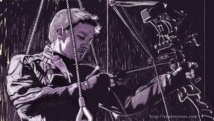
Jeremy Renner as Hawkeye in Thor. Reference provided by Marvel.
But it’s not so simple. Tablet drawing is a whole new medium in its own right and at first it can stump a lot of traditional artists. When you draw or paint something, typically you are looking at the subject and not at what you’re drawing– this is the ideal method, but not everyone follows this. You can’t look down at what you’re drawing with a tablet; there is nothing there. They’re coming out with new screens you can directly draw on which circumvent this, although I don’t know how well they work yet.
Even if you are used to looking at the subject while drawing, there is still a disconnect between what you are drawing and what’s on the screen and it takes a little bit of time to get your hand and eye re-coordinated. In essence tablets add an extra ‘surface’ or plane of view to the equation: rather than just having the subject and the drawing, you have the subject, the drawing surface, and the drawing that appears on your screen. This is one of the hardest things I faced when beginning to use my tablet.

Joshua Jackson as Peter Bishop in Fringe. Reference provided by FOX.
Digital brushes also can give artists a bit of trouble, which is why I’ve taken the time to go over what settings I generally use. Photoshop comes with some very nice traditional wet media brushes, and artists are always suggesting and creating new brushes. There are many more options than just the default ‘airbrush’ rounds, and you can find some to start with by opening up the brush window and looking at the various presets. Then you can fine tune each brush with more settings, which I’ll get into in a bit.
Finally, about 90% of what I do is utilize traditional techniques, with just some tweaking to compensate for the digital medium. When you’re tablet painting or drawing, you are in essence still painting or drawing; the only thing that really changes is what equipment and materials you are using. Most of the rules about perspective, proportion, composition, and color theory still apply.

Thom Yorke, Glastonbury 2011. Reference photographer unknown.
A Word About Equipment
It’s worth noting that depending on your tablet model, you can do different things. Later when I talk about the brush settings, for example, I mention ‘pen tilt’. Tilt sensitivity is a thing not all tablets feature. The size of the tablet drawing surface can also vary dramatically. I am currently using a Wacom Intuos 5 Touch size large, which gives me a drawing area around that of a legal-sized piece of paper.
There are a bunch of drawing programs out there, some of which are free like GIMP. Nowadays I use Photoshop to do my portraiture and the settings I mention may vary or not be available in other drawing programs.

Tori Amos, American Doll Posse Tour. Reference photographer unknown.
Freehand– Not Tracing
Finally, I just want to make it clear that I draw freehand using photos as a reference only. I know there are some digital artists who merely draw over top of a photograph in Photoshop, or apply filters to make their photographs appear ‘painterly’. That is not what I do.
That’s the overview of digital portraiture. Stay tuned for part 2 where I talk about picking a suitable reference photo as well as the settings I use on my tablet, document, and brush!
Onward and Downward (Crowley from Supernatural)

Just a quick sketch I did the other night of Crowley from Supernatural. The hardest part was the armpit region of the suit, believe it or not. Who thought that’d be so hard to get right? Obviously it’s a demonic conspiracy.

Almost Done With Hot Guy
Jeremy Renner as Hawkeye from Thor and The Avengers movies. My first monochrome (purple of course)! I thought all the cables and lines of rain would be a fun challenge. HAHAHAHAHAHAkillme
Digital paint portrait of my other kitty, Fiona

I’m doing a series of all my sweeties because they deserve it, but also to brush up on my pet portraiture. So here’s Fiona, my other living kitty, in a rare moment of repose.


Tori Amos portrait

Here’s another digital portrait for your viewing pleasurrrrre. This time, Tori Amos as Pip from the American Doll Posse tour.

Digital Portrait Commission #1- On Golden Pond
Here’s Amy Pond, the first of the digital paint portraits I promised to people who helped me name my new webcomic (which, by the way, will end up being “So I’m the Alligator, Then?” Thanks Alan, for inspiring me). This one is for Cait (realityshmality), whose instructions were something like “surprise me.” Hope you’re surprised 🙂

I do comix now. Comix are cool.
I did another comic! I’m hoping to do a full series now that the tablet’s made it easier. You know how the archives for webcomics always have a few really crappy ones to start while the artist is working out the style? Well. That makes me feel better about this:

Also, I need a name. Any ideas?
What big teeth you have, Master
My first digital painting! I contributed this to an upcoming Doctor Who calendar for the best_enemies comm on Livejournal. I think the subject matter is pretty self-evident.

